
GramCity
Your photo editor + guide, a.k.a ViewFinder to finding picture-perfect places wherever your travels take you.
A Design Sprint Challenge
Overview
Duration: Jul 2025 (1 week)
Role: Research, Design, Testing
Organization: Springboard in partnership with Bitesize UX
About GramCity
GramCity is a photo editing app designed to help users enhance their photos before sharing them on social media platforms like Instagram.
Problem Statement
GramCity aims to help users discover great photo locations nearby, including tourist attractions, landmarks, interesting architecture, and public art, by introducing a new in-app feature.
Design Constraints
Must be a feature within GramCity mobile app.
Focus on helping users discover physical locations.
Build an active community for sharing favorite spots.
User Personas
In addition to sharing the problem statement and the design constraints, Bitesize UX provided user personas to kickstart the design sprint challenge.

Nick: The Casual Traveler
Nick enjoys spontaneous road trips but often regrets missing nearby photo opportunities. He seeks an easy way to find great photo spots without extensive pre-trip research.

Sarah: The Photo Planner
Sarah meticulously plans her photo trips but struggles to find detailed information, often wasting time on disappointing locations. She aims to easily discover prime locations with photo examples to plan her day efficiently.
I decided to implement the Google Venture (GV) Design Sprint developed by Jake Knapp that follows a 5-day design process illustrated below:
Day 1: Make a Map & Choose a Target
Let’s Zoom In on the Problem
12-Month Goal
Help users easily discover and share great photo locations near them, wherever they are, fostering community contributions.

Guiding Questions
What might stop a user from checking out a suggested photo location?
What could make someone hesitate to share their favorite photo spots?
What would cause a user to ignore this new feature?
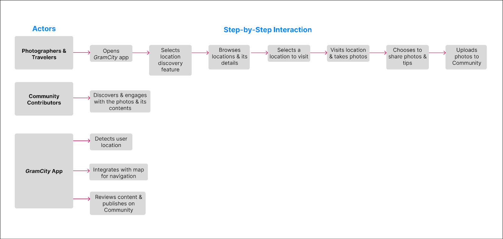
Mapping the End-to-End User Experience
I wanted to clarify how travelers discover, explore, and share photo spots, helping me design smoother, more meaningful interactions within GramCity.
Day 2: Sketch Comepting Solutions
Time to Frame the Ideas
Lightning Demos: Key Observations
Strong visual inspiration, but requires prior knowledge of places; location details are often buried.
Crazy 8s Sketches- Visualizing Range of Solutions
Google Maps
Good for nearby discovery and navigation, but lacks visual curation for photographers.
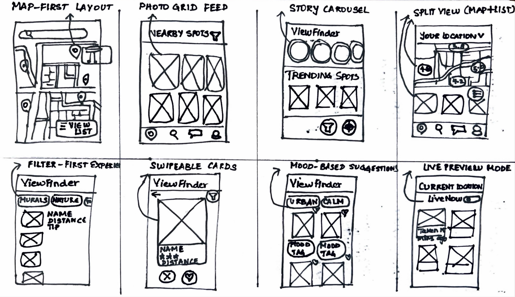
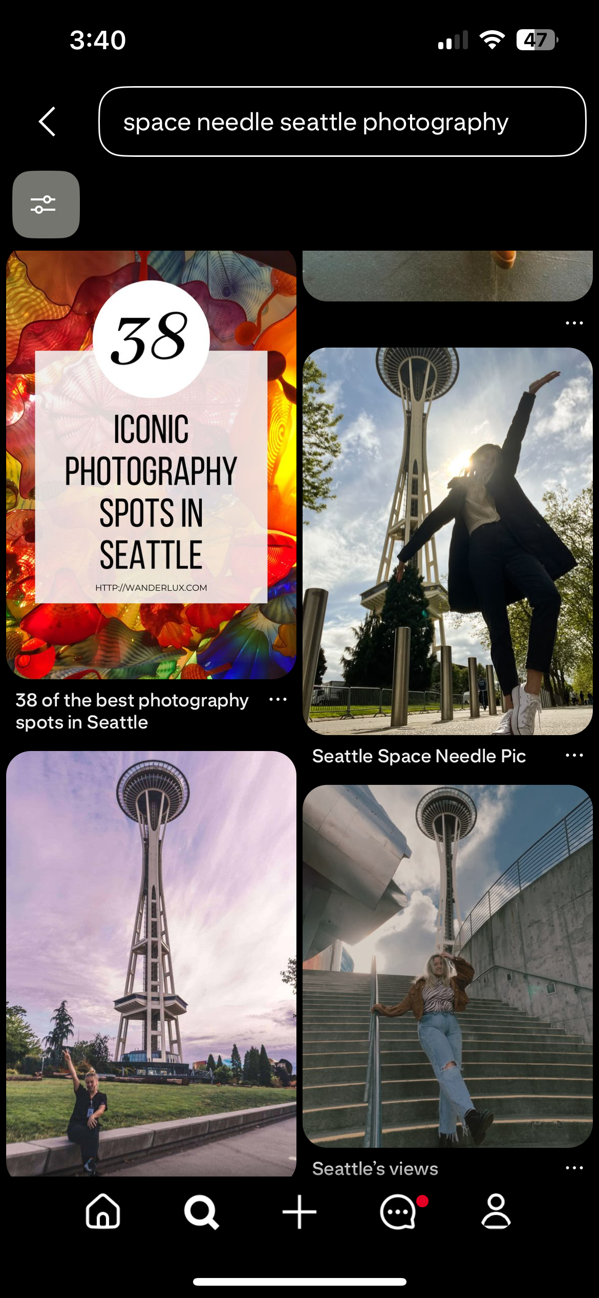
Excellent for aesthetic inspiration, but not optimized for real-time discovery or accurate location details.
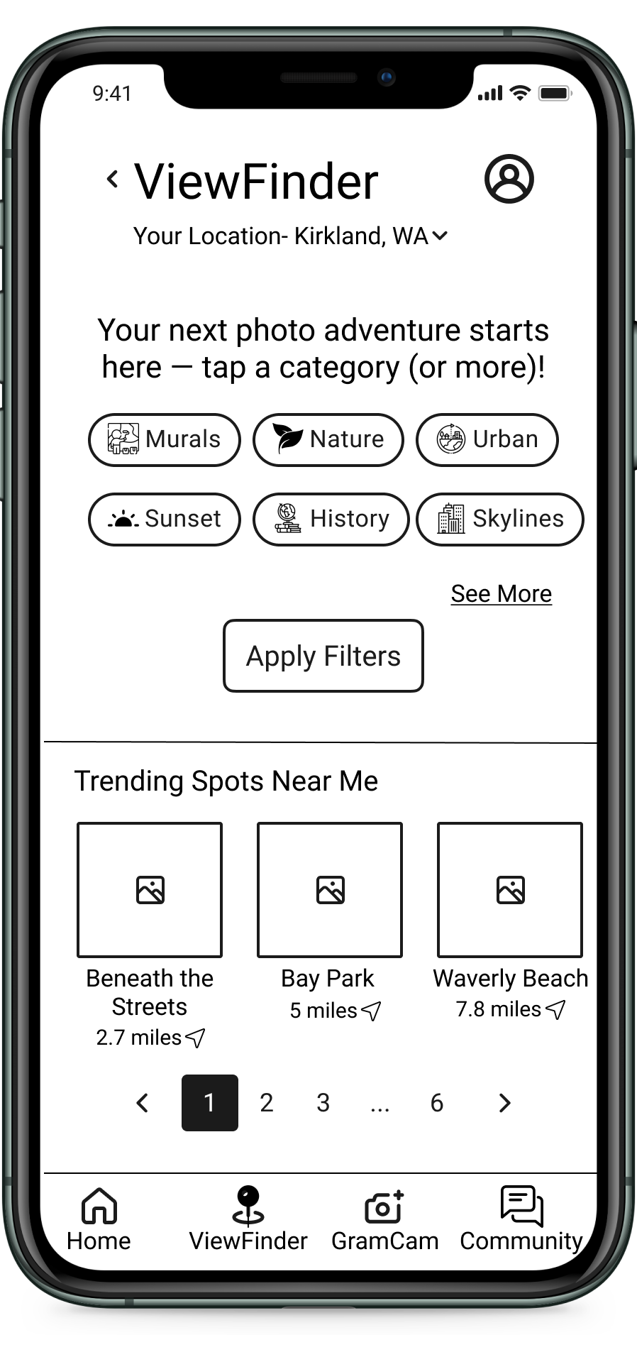
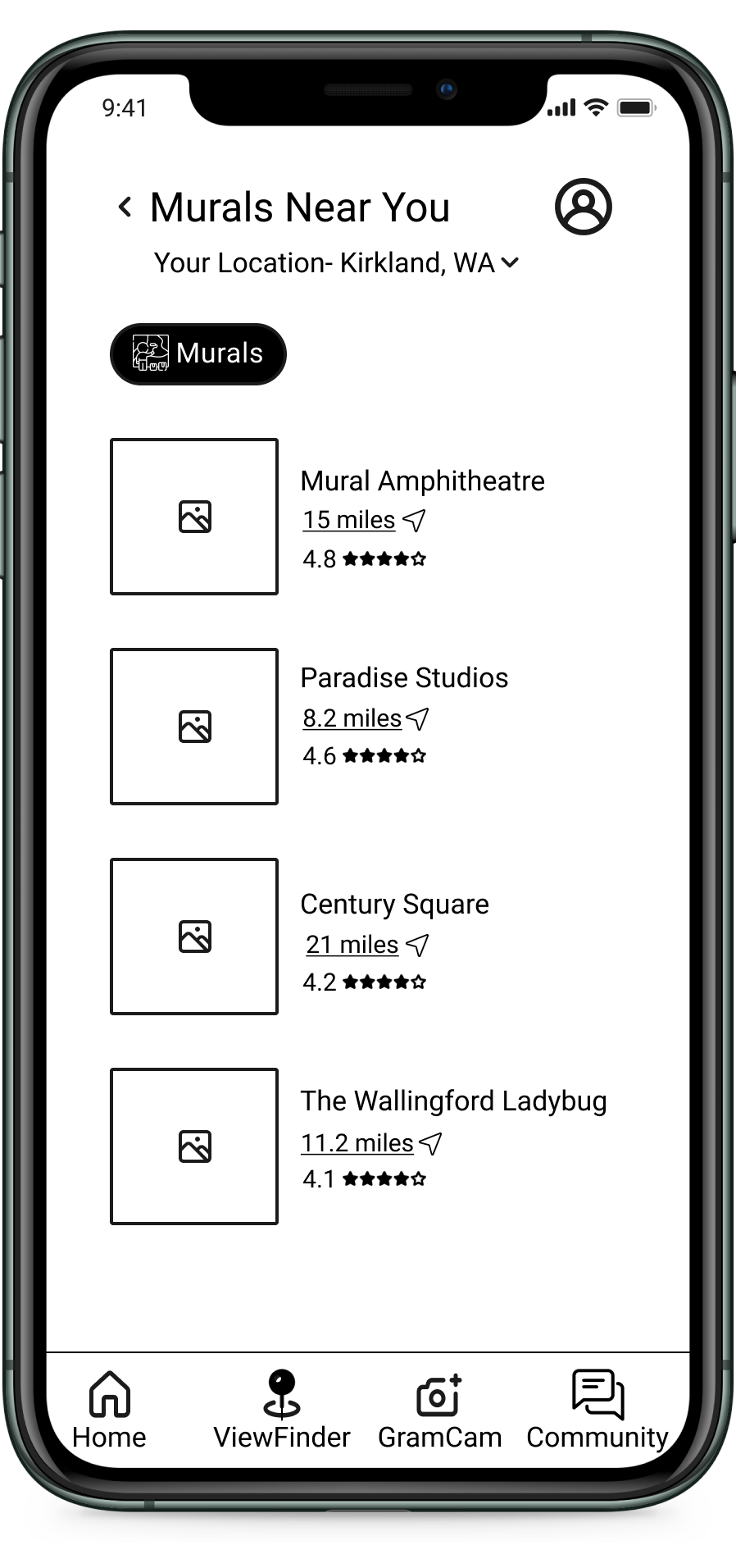
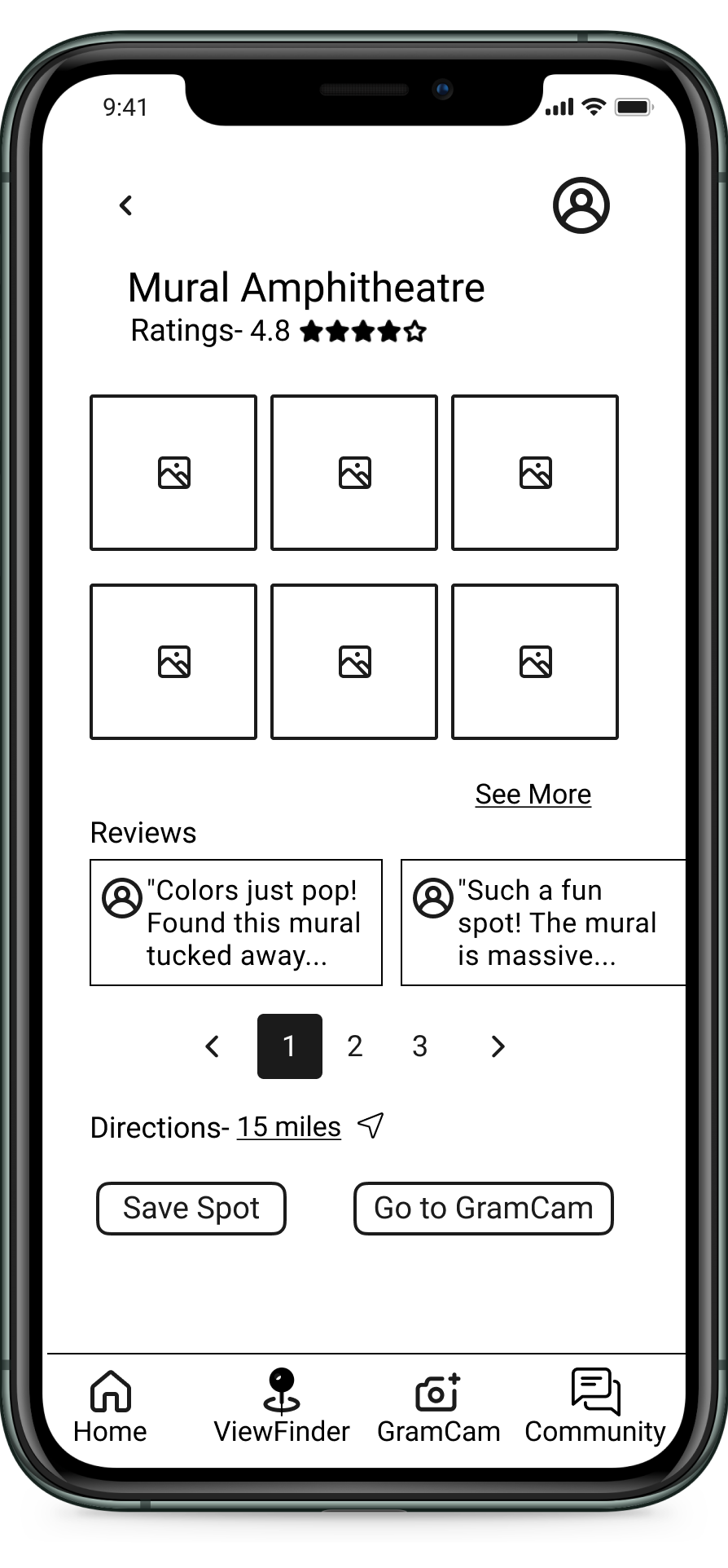
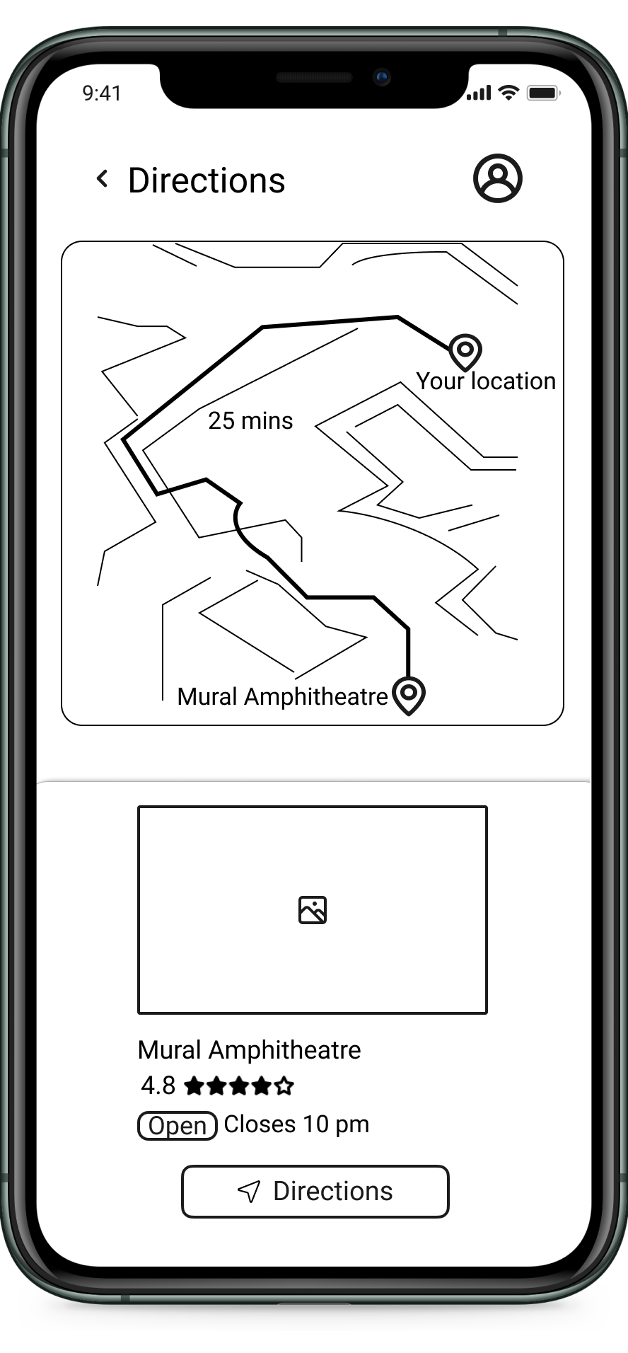
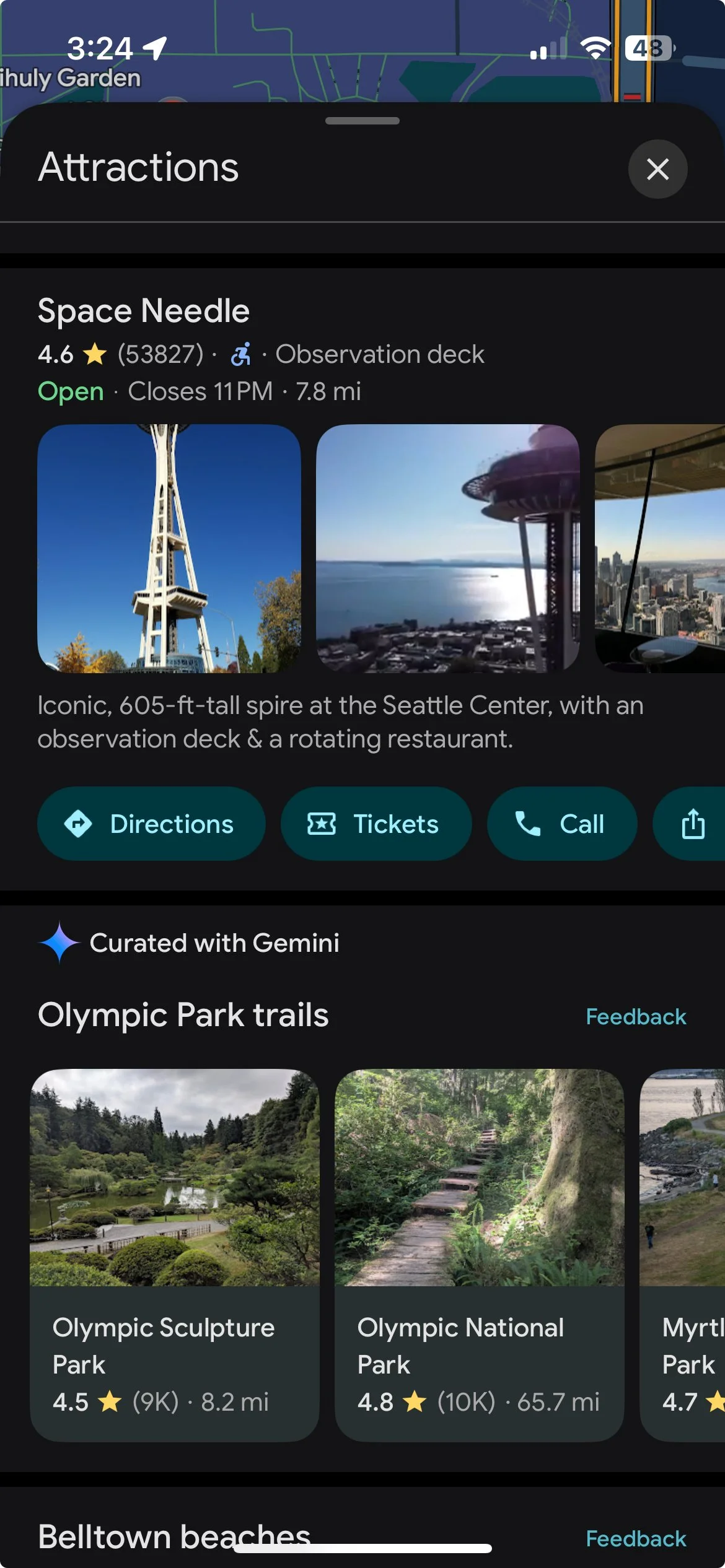
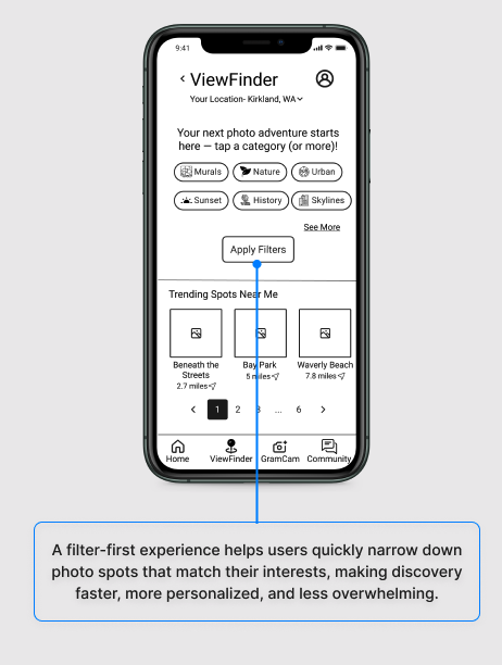
Sketching the Filter-First Experience (I call it ViewFinder)
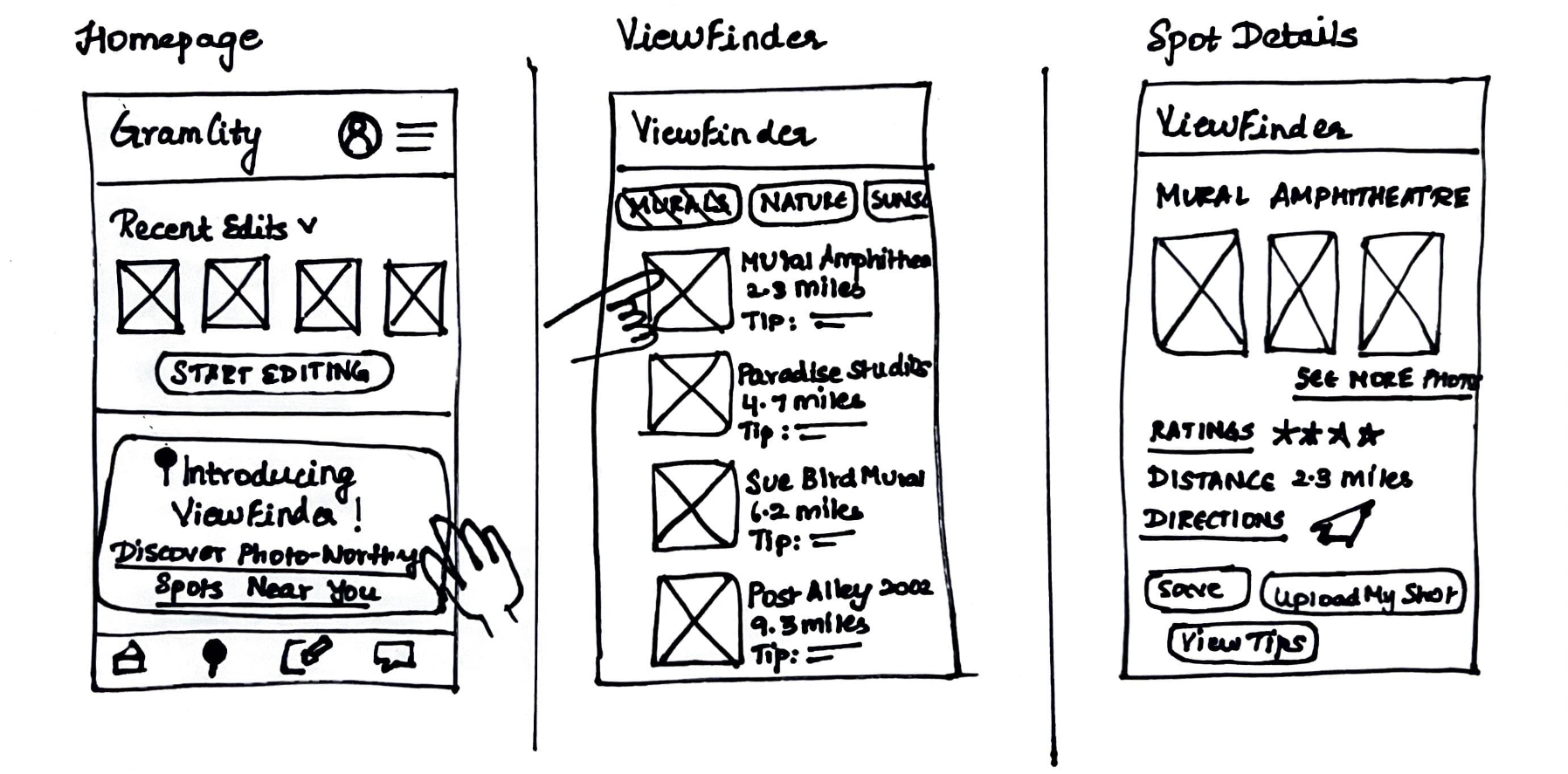
Day 3: Decide on the Best
Storyboarding the Perfect Photo Journey
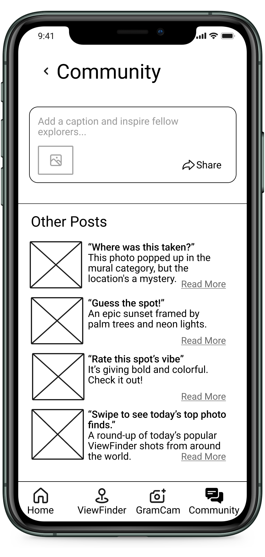
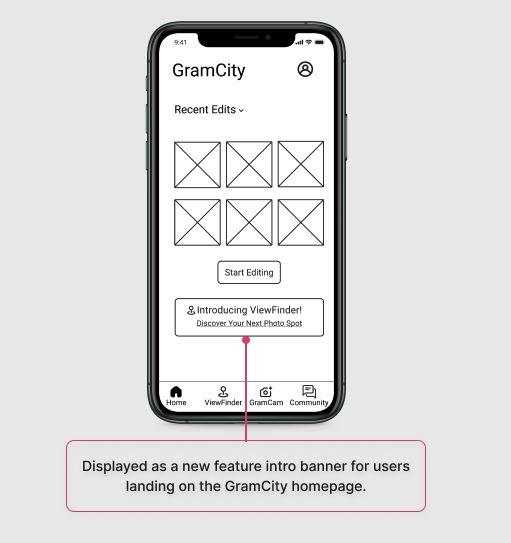
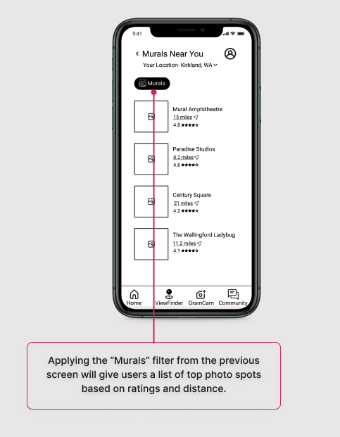
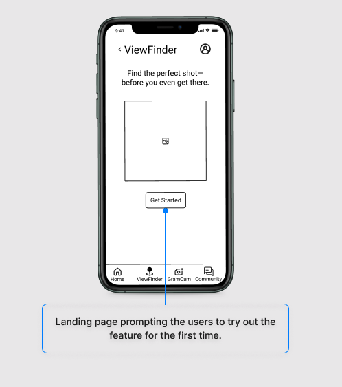
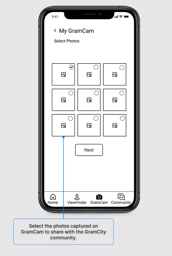
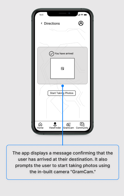
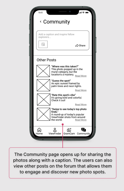
A 10-panel storyboard was created to visualize the user's interaction with the ViewFinder feature, from opening the app to discovering and saving a photo-worthy location.
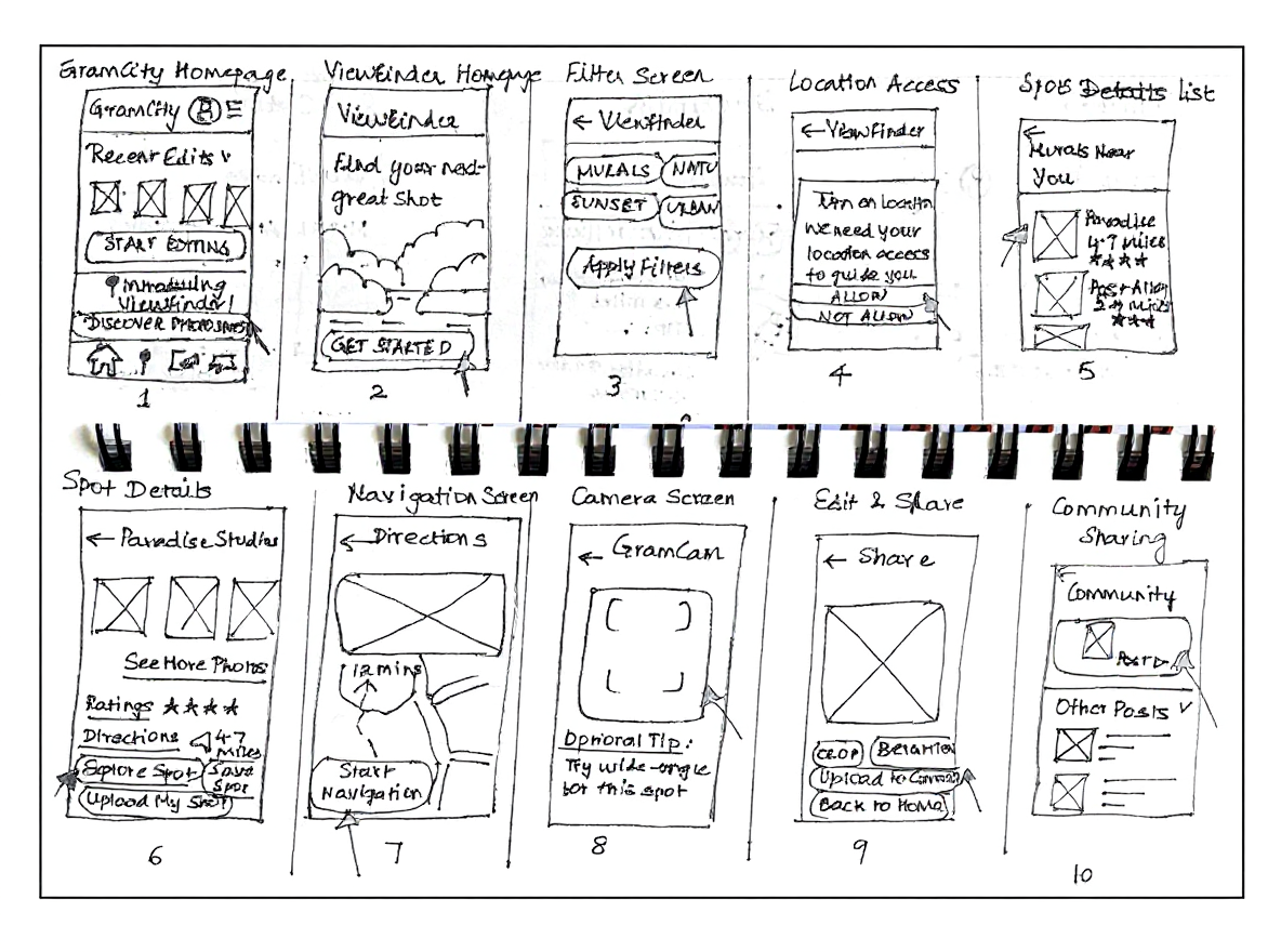
Step 1
Step 5
Step 2
Step 6
Step 9
Step 3
Step 10
Step 7
Step 11
Step 4
Step 8
Day 5: Test with Target Customers
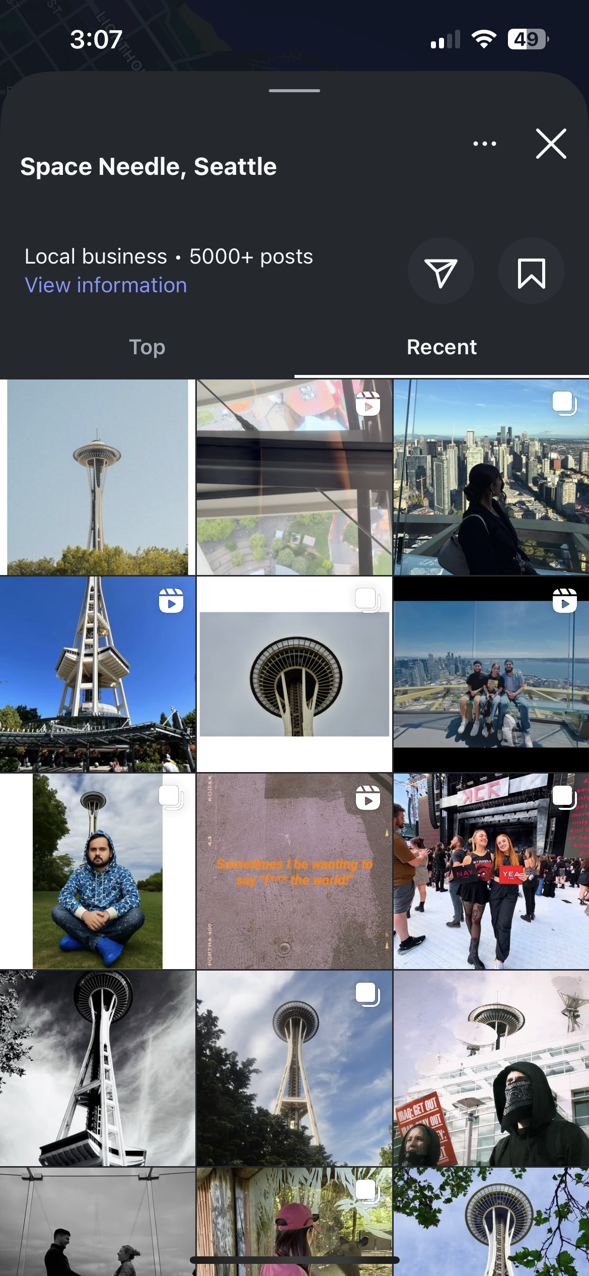
Usability Testing & Key Findings
Five users- influencers, hobbyists, and tech professionals were interviewed using the 5-Act Interview technique. Sessions were conducted remotely, focusing on user interaction and think-aloud feedback.

Positive Reception
Users appreciated the all-in-one filtering, directions, photo snapping, and sharing.

Camera View & Prompts
Some expected a live map-based camera view and clearer next steps after using GramCam.

Sorting & Detail Needs
Users want more sorting options (especially by distance) and detailed spot info (e.g., photo recency).

Community Engagement
Participants seek more interactive sharing options, like direct posting with hashtags.
Lessons Learned

Start broad, then focus: Diverging with multiple ideas early on helped surface creative directions, but converging on one solution (the filter-based experience) gave clarity and momentum.
Constraints fuel creativity: Knowing this had to be an in-app feature and not a standalone product helped prioritize simplicity and integration over flashy add-ons.
Storyboards build alignment: Visualizing interactions step by step created a shared understanding of the user journey before prototyping.
Time-boxing drives progress: The sprint’s five-day structure showed me how setting strict time limits pushes fast decisions, helps ideas evolve into testable prototypes, and keeps momentum over chasing perfection.